A closer look at the Swiss tourism sector using Power BI for data analysis
Blog
A closer look at the Swiss tourism sector using Power BI for data analysis
In this blog post, we will look at Swiss tourism from a numerical perspective. We will use data that is provided by Switzerland Tourism. The data is read directly to Power BI by using their REST API, and the data is updated three times per day. Switzerland Tourism is an organisation that works with promoting tourism in Switzerland. On their website, they present information about Switzerland, and they also list current accommodation deals for example.
Introduction to the Power BI report
Using the REST API, we can read all of the accommodation deals instead of having to browse the site. We can then visualise it in our own ways and filter as we prefer. The API also offers the possibility to read information about Switzerland’s extensive possibilities for activities like skiing in the Alps, hiking, biking etc. We have a previous blog post which explains more on how to read data from a REST API to Power BI.
In our Portfolio, we have a report, called “Report of available offers”, which looks at all the current offers listed on Switzerland Tourism’s website. These offers are mostly accommodation deals, but they can also be one-day conference offers at reduced price as an example. We also have a page with information about the different activities, typically outdoor activities, that are found in Switzerland.
Using the report for analysis
Starting with the available offers, we have created a simple page, which is seen below, consisting of:
- Two filters – Price and Location
- One chart – When do the offers expire?
- Four numerical KPIs
- One map – To show where the offers can be found
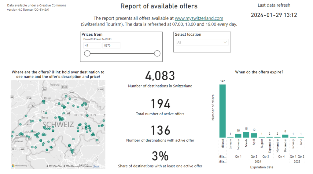
According to the data read from Switzerland Tourism, there are 4 083 destinations, such as hotels, hostels, bed-and-breakfasts, etc. across Switzerland. We can see that there are 194 active offers listed at myswitzerland.com. We also see that there are 136 destinations, out of 4 083, that have at least one active offer. This means that there are some destinations that have multiple offers active at the same time. Dividing the 136 destinations that have an active offer by the total number of destinations – 4 083 – we see that 3% of the destinations have at least one active offer. There is also the possibility that there are more offers, offered only locally on hotels’ websites etc., but the numbers used here are the ones listed on Switzerland Tourism’s website.
We also see in the chart to the right that most offers expire during the spring in 2024. This is reasonable for two reasons. First, the skiing season in the spring time is quite popular in Switzerland so there will be many offers related to skiing. Second, it is common not to publish offers too far in advance, so mostly “near-term” offers will be listed.
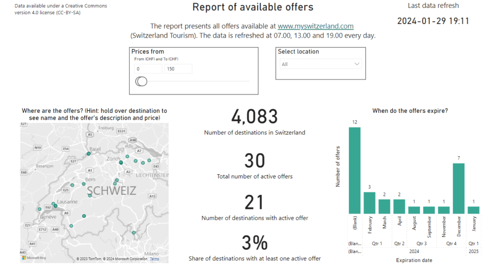
We also offer the possibility to filter by price. For example, if we want to find offers below 150 CHF, the page will be updated and look like this. As can be seen in the picture below, there are 30 such offers currently available.
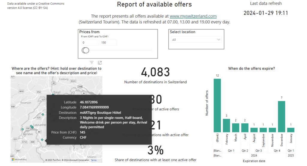
We can hover over the map and get some additional information for each destination, like is shown below.
Our report is updated three times per day, and we could have chosen to update it even more frequently. It is interesting to see how data is being used within the (Swiss) tourism sector, and we see a few interesting use cases. For example, a hotel could set up this data pipeline in order to monitor what their competitors are offering, respective not offering, and what are the current price levels.
Find offers by location – Luzern as an example
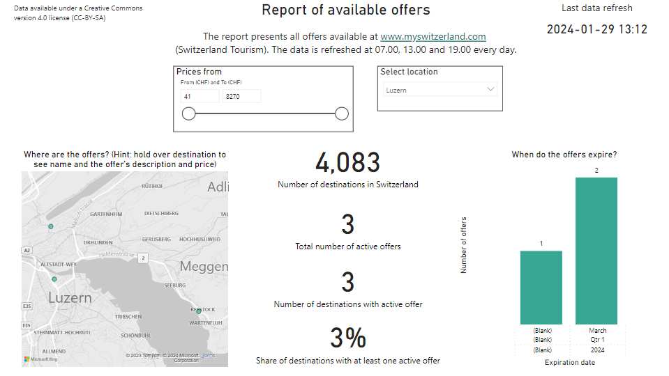
We can also filter by location. Here we filter in order to find available offers in Luzern. There are three offers available at the moment in Luzern.
Skiing, hiking and biking in Switzerland
We also read data over available tours in Switzerland, which are for example skiing, hiking and biking tours, but also categories like “City Breaker” and “Family” are available. In this post, we will analyse the data behind the hiking tours found in Switzerland. So, we start by using the filter Tour type and set it to “Outdoor Enthusiast – Hiker”.
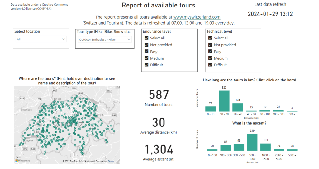
Each tour comes with a location, name and description. This way, we are able to visualise on the map where it is located, and the user can also hover to read more information about the tour.
Each tour also has a certain length and ascent listed in the data stream. This way, we are able to visualise the different lengths and ascents. For example, the users might be looking for a tour length between 10 and 20 km. We can see in the chart above that there are 325 such tours.
Each tour is also classified with respect to the endurance level and technical level required. Typically, long tours with much ascent will be classified as Difficult both with respect to endurance and technical levels needed. Vice versa, a short tour with little ascent will typically be classified as Easy with respect to the endurance and technical levels needed. For example, if we filter by Difficult endurance level, the page will look like this.
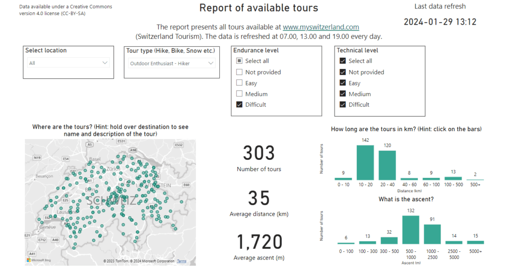
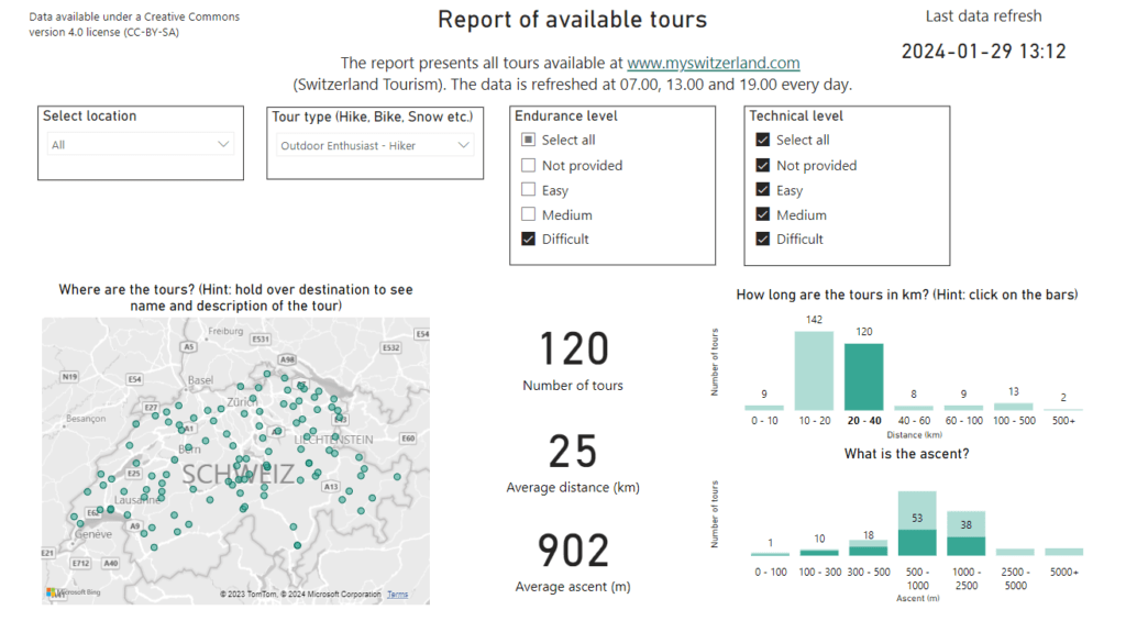
We see that there are 303 difficult tours, and we note that the average distance is 35 km while the average ascent is 1 720 meters. A great way to use the dynamics of Power BI, is to click on a chart and then filter the rest of the page. Here, we filter by clicking on the 20 – 40 km distance range in the chart. We then see, in the picture below, that there are 120 tours in this range. The average distance as well as the average ascent changed – to 25 km and 902 m, respectively. The chart with the distribution of the ascents also updated, to visualise what are the ascents of these 120 tours.
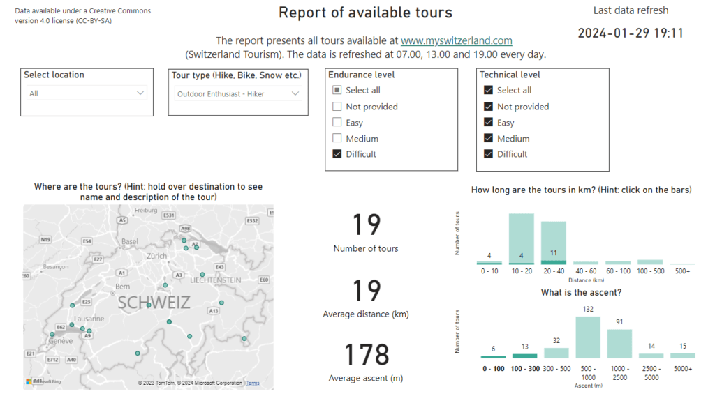
Conversely, we can do the opposite. Suppose we want to find a tour with an ascent of at most 300 meters. We then see that there are only 19 such tours, which at the same time are at a Difficult endurance level.
Summary
In this post we have used a Power BI report to look at data related to the Swiss tourism sector. We also explored how the map visualisation can be filled with information in Power BI. In addition, we learnt how to dynamically filter a page by clicking on the data point of interest, in this case the Endurance and Ascent parameters. Finally, we hope that you find the report useful when planning your next trip to Switzerland.
More blog posts
A closer look at the Swiss tourism sector using Power BI for data analysis Read More »

